All projects

Client since:2024 - Present

Industry:Management & Communications

Project duration:2 weeks

  • Brand Identity

MYSA is a marketing management company with an established roster of clients but no product identity of its own — a business that presented itself through everyone else's brand and none of its own.

A unique, recognisable logo that conveys bespoke solutions and European craftsmanship, elegant enough to sit alongside the premium clients MYSA represents.

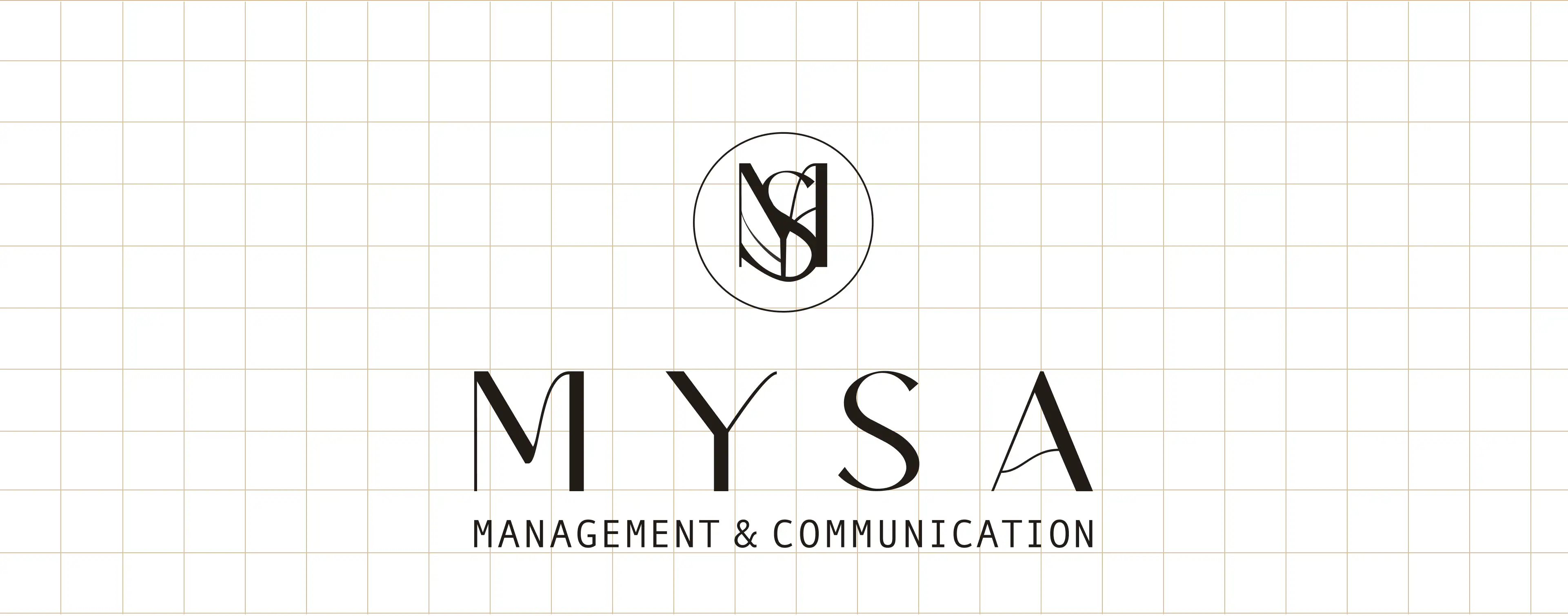
We built MYSA a complete identity system from the monogram out: an interlocking M–S mark drawn on a precise construction grid, a refined serif wordmark, and a flexible family of stacked and horizontal lockups. We then proved it in the wild — across signage, stationery and interior environments — so the brand reads as bespoke and unmistakably European wherever it lands.
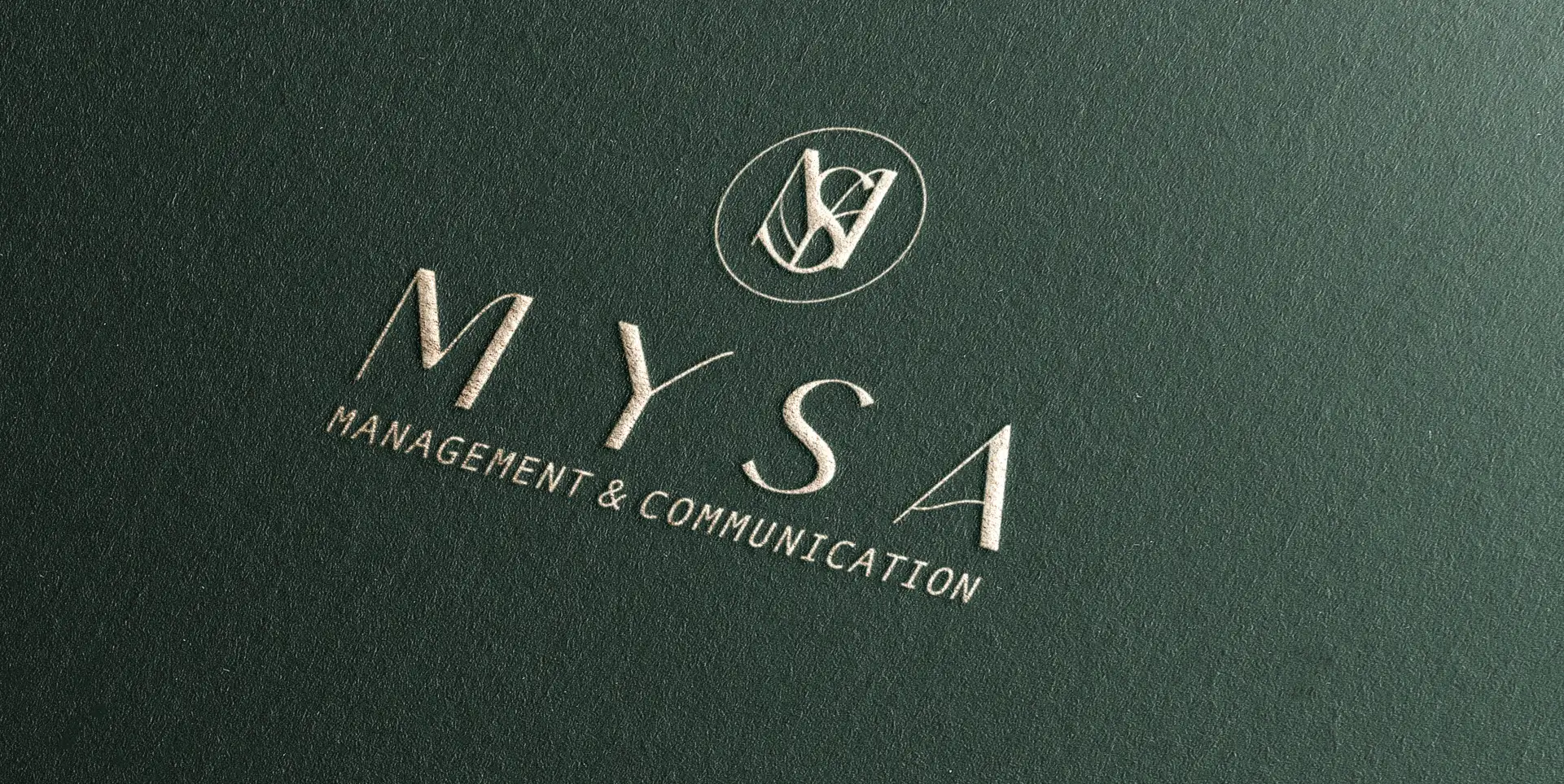
The MYSA monogram and wordmark embossed in pale relief on deep-green textured paper
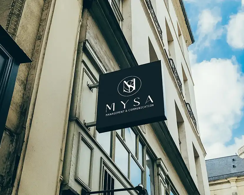
A black MYSA blade sign projecting from the stone facade of a classic European street building
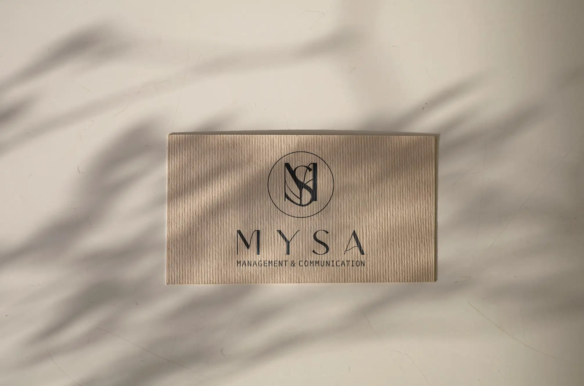
The MYSA monogram and wordmark debossed on a ribbed kraft box under soft palm-leaf shadows
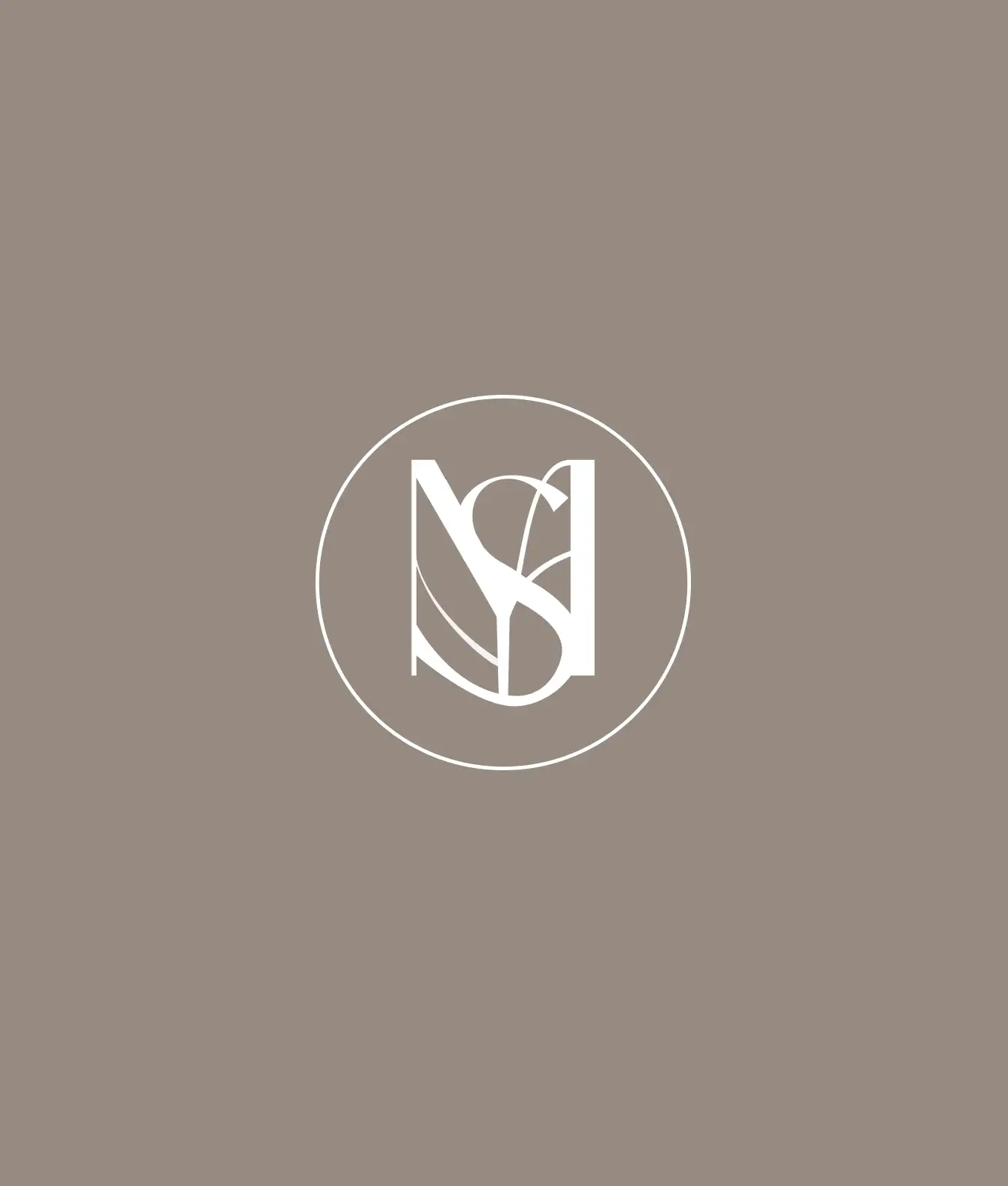
The MYSA monogram — an interlocking M and S inside a circle — in white on a warm taupe field
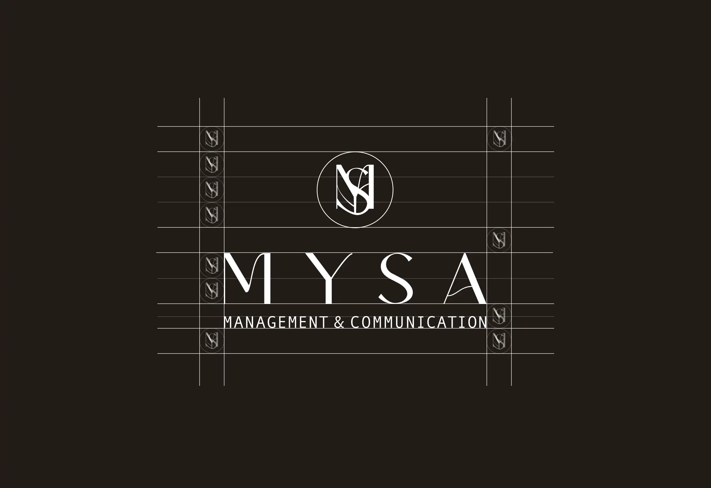
The MYSA wordmark shown with its construction grid and alignment guides on near-black
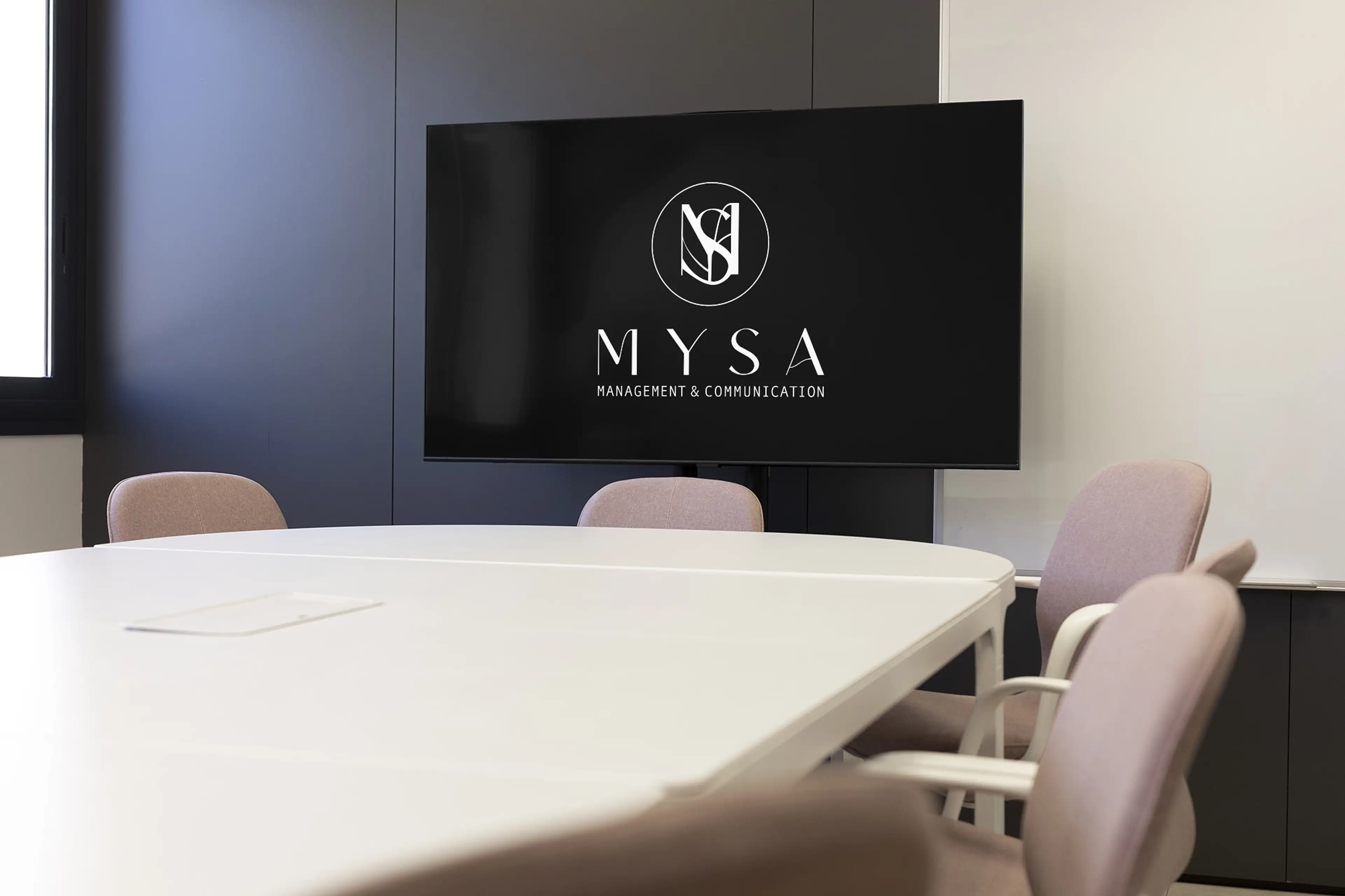
The MYSA logo on a wall-mounted screen in a modern meeting room with blush chairs and a white table
The stacked MYSA lockup — monogram above the wordmark and tagline — in black on blush
The horizontal MYSA lockup — monogram beside the wordmark and tagline — in black on blush
The MYSA wordmark and monogram centred on a light architectural grid
MSVE